UX Designer

Fly UX
Overview
Fly UX, a start-up airline app is looking to create an online experience that is fast, easy, and intuitive. The excitement of going abroad is often overshadowed by the stress of booking flights, as the industry remains packed full of bad design. Though there are plenty of options available to users, I don't believe there is currently a website that streamlines the flight booking process, offering users a simple, fast, and enjoyable journey.
Role: Research, analysis, design, delivery
Date: Feb - May 2021
Tools: Wireframing, Figma, SketchApp, Leadership, Prototyping, High-fidelity prototyping, UX field research, Usability testing, Web and mobile, Typography and branding, B2B/B2C
The Process
Research
Define
Validate
Design
Prototype
Build
Launch
QA test
User Research:
At the discovery phase of my project, I aimed to get a broad understanding of users' goals, behaviour and challenges. Using the Triangulation methodology (inc. competitive benchmarking, online surveys and user interviews), I understood which practices to emulate and those to avoid.
Benchmarking:
Context:
-
For the competitive analysis I identified the popular airline sites for the target audience. I analysed sites, such as Easy Jet, which allows the user to choose a bespoke journey, in comparison to Sky Scanner and Opodo which chose flight combinations for the user, giving the user less autonomy.
General conventions
-
Home page: The mechanic for booking flights was clearly central to each home page with key functionalities easy to understand and use
-
Search and select: It is assumed that the user would prefer to select their dates using a calendar rather than typing them in
Pain points
-
Search and select: Skyscanner.com is the only website to offer multi-city – other websites presume you are returning to the same city
Best practice
-
Home page: Deals sold on homepages, but not to distract from the user's journey
-
Search and select: Websites assume that the user will not know the name of the airport, but more likely to know the city that the airport is in
Findings:
Consider in personal designs:
-
A calendar view of dates
-
A clear view of available airports when users just type in the city’s name
-
The ability to edit the user’s flights throughout the journey
-
Date comparisons to show alternative flights
-
Avoid too much baggage information – make sure to not repeat sales to the user
-
Avoid too many promotional pages
-
Personalising deals based on the user's location
Online survey
Context:
-
To widen my understanding, I sent out an online survey. Nineteen people replied between the ages of 70-28 years old.
-
Types of questions included:
-
Were you able to achieve the task that you set out to do during your visit to the airline website or app?
-
What obstacles, if any, frustrated you whilst trying to complete your task?
-
What would you change about that website or app in order to improve your experience while using it?
-
Difficulties:
-
I would have gained more informative insights had I not surveyed users during a travel ban caused by Covid-19.
-
I would love to increase my survey size in the future to get richer data
-
I would like to offer more of an incentive for taking part in the survey, this would encourage more insightful answers, rather than leaving questions blank
Findings:
-
Promotions often frustrated users
-
Users preferred their previous information to be saved to the sites
-
Skyscanner, which offers multiple airlines was the most used website
User interview
Context:
A user interview supported these findings which meant I felt confident that these findings should dictate my final design choices.
Difficulties
-
Would have preferred to have interviewed more than one user
-
Should have avoided some leading questions
Findings:
-
What users may not recall frustrates them (so don't tend to include in surveys) become apparent in interviews
-
I enjoyed understanding frustrations caused by what I may assume is a common convention


Analyse and Define:
The second define phase included affinity mapping, user experience journeys, user flows, and defining design challenges.
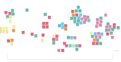
Affinity diagram
-
I created an affinity map by grouping together users quotes and research notes. I used my strong analytical skills to pull out more abstract themes and help the team see the overarching themes - an effective way of putting a structure on the qualitative research data.
-
Though affinity diagrams are typically good to show the power of collaborative analysis, due to the peak of the pandemic, I undertook the task alone.
-
Tool: Miro App.
Difficulties
-
Affinity diagrams benefit from different people's perspectives of notes, which brings groupings together in a way that one researcher may not expect. As I was on my own I made sure to review the groupings a few times - leaving time in between each 'session'.
-
Looking at the scrambled research on your own for the first time was overwhelming


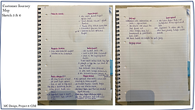
Customer journey map:
Building on my affinity diagram, I created a CJM to add even more structure on my analysis.
By defining the high-level steps in the user journey which, more or less aligned with the groupings from my affinity diagram.
Against this axes, I mapped out any positive, painful or missing interactions and included any quotes worth noting.


Designing the solution
During the design stage, I used the power of design principles, to create the foundations for high quality software. Design principles are the proven guidelines and rules for effective design - they are the universal truths that have remained relevant through the test of time.

User flow diagram
Tool: Figma
The initial stages of the design process.
Objective: to fix the issues uncovered during the research and then highlighted in the analysis.
My high level flow diagram, focuses on one flow - the primary use case. It is important to define a clear structure and information architecture for the software, using intuitive navigation - creating a smooth flow for the user.
Before I design the screens, I need to consider the structure of the software and how I would like the users to flow through it.
An effect way to visualise the relationship between the content and examine the hierarchy.
Sketching
With the key features and user flow defined , I could sketch low-fidelity screens using pen and paper. It enabled me to examine my ideas before moving onto digital wireframes.
The sketches demonstrate how I will address all the issues and user goals identified in the research and analysis.
My primary aim was to ensure simplicity for the user:
-
clear call-to-actions.
-
clear and short user journey, though allowing for user's who change their mind during the journey.
-
stick to conventions that users are used to and go back to.


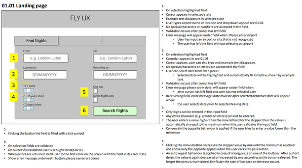
Wireframes
To finalise my design process, and to make sure my handover was as detailed as possible I created high-fidelity wireframes. I made sure that I included as much detail as possible so that the developers can build the product accurately.


Reflection
What I would like to improve:
-
More testing at all stages, whether that is including more users to interview or testing my prototype.
What went well:
-
Users will know what to do since there are clear CTAs.
-
Users can follow the high level flow without confusions.
What was the main takeaway:
-
Simplicity:
-
Avoid any distractions from the primary goal of the user at the particular stage.
-
Allow the user to change their mind.
-
Make assumptions based on previous searches and web history.
-
"All the hard work has paid off Mary. Congratulations!"
'UX Design Institute'